• Hi Guest, want to participate in the discussions, keep track of read/unread posts, upgrade to remove ads and more? Create your free account and increase the benefits of your BigSkyFans.com experience today!

Rose City Red, Green & White as school colors

BroadwayVik

Active member
ZZZZzzzzzz. Wha-wha what?

grumpy-coffee-mug-cartoon-character-holding-smaller-mug-grouchy-coffe-trying-to-wake-up-morning-hot-beverage-real-30348934.jpg

You mean Montana offered Portland State to make PSU's home game (such as it is) into an away game, thus a home game for Montana? Gee, how thoughtful of them. I see their point, it practically a home game for them already when you consider the game attendance, where the crowd members place their loyalties.
il_340x270.654523310_4kj7.jpg

One problem we have is our games are really presented poorly. No one tries to present the event in a quality professional manner. The main vibe seems to communicate simply an overwhelming lack of interest from the community. There seems to be so much apathy. For an NCAA football game day event! How pathetic is that?
100905RockStar.jpg

That would appear to be the fault of the homegrown portion of our athletics management, the Oregonians on staff. Our uniform colors kind of fade into similar shades of green and white color as on the field of play below them. Makes one want to yawn, stretch and dissociate.
dissociate_by_kwasira-d73rczy.jpg

When returning WWII Vets came back to become part of what would first be organized and become Portland State, what school colors did they select back in the day? Oregon State chose orange long ago (yes, and black). If Oregon chose green, why are we duplicating them? As an in-state institutional courtesy, oughtn't we choose not duplication, neither green nor orange?
622x350.jpg
622x350.jpg

But our colors look like watered-down UO colors, as UP's colors look like watered-down UW colors. Yes, there are green trees in the Pacific NW. But you don't see green in the color schemes of UW, WSU or OSU, do you? Why is that?
275px-Oregonducks_football.png
636096218583148507-Junior-Espitia-I.JPG

It is bad logic to insist upon green for a NW school color simply because we are in the midst of greenery environmentally. What are traditional Viking colors? Are there any? For the sake of originality, we can take from among the remaining colors. Blue is for the Seattle Seahawks. We really ought not make that our primary color, but secondary accent colors have more leeway. UW has gold, WSU has silver, UO has yellow and OSU has black. Thus, we could have green as a secondary accent color.

BqOO9KVCMAAUvzZ.jpg:large

I'm holding out for Valerie Cleary. I think she has something good inside her. Look how things have become more dynamically presented since she (and her vision) took over the helm. I hope it continues.
21711568-standard.jpg
 
I like green as one of our colors. Green is what is consistent with the armed forces and the veterans and that was what the university was founded on. Also, the city of Portland is considered to be a "green" city (more than Eugene). Instead of blue, I would rather see a red color, as we are the only DI football university representing the City of Roses, and from what I remember of nursery rhymes (and Bobby Vinton, of course), "Roses are Red".

I do think we need to get rid of the black. I think Glanville put a curse on the football team by going with that color.
 
If you add red, yay Christmas (begging the question "who else does green and red?"), but I tend to think if you go red, then keep black and junk green because it'll fall in line with the Blazers and Winterhawks.

Of course, my main comment from the blue/silver thread stands. The colors are not Portland State's biggest problem... and Broadway's framing is how we almost ALWAYS have discussed these issues.

I could add a cheeky piece of speculation that an attempt to mimic Seahawks colors will get you thrown out of Providence Park because Seahawks and Sounders have close ties and Timbers Army would therefore demand blood... but that's speculation.
 
If people insist on mimicking the Ducks with green, then we do need another color to differentiate ourselves. Red is the color of roses and the City of Roses. Might be a very good experiment in color scheming to put those two together.

red-rose-1.jpg
red-rose-1.jpg
red-rose-1.jpg
red-rose-1.jpg
red-rose-1.jpg
red-rose-1.jpg

it-lgflag.gif
6-49-RJ9550D.jpg

red-rose-1.jpg
red-rose-1.jpg
red-rose-1.jpg
red-rose-1.jpg
red-rose-1.jpg
red-rose-1.jpg


Might not be so bad a combination at that. Certainly has meaning that is purely Portland. So much more so than UP's purple and white. Roses are red for the City of Roses.

City of Roses til I die! Now that gives us a unifying link to the Timbers' crowd.

Makes sense. I like it. I think it is awash with meaning and would give Portland State the missing element that has been theirs all along -- the fire, heart and romance from the rose's color red. Neither Oregon nor Oregon State has a claim to red. This is the benefit I was hoping to gain for PSU through such discourse.

There is much to be gained from cultivating these ideas with one another. Let us now need begin to seek to trade off black for red. The more I think about it, the more I like it. We need a fire in our bellies and red is the answer. The rose itself is the missing element for Portland State's identity, the public university for the Rose City!! Of course!

* * * * *

DangerWillRobinson.jpg
Bill-Mumy-Net-Worth.jpeg
 
Broadway, first you have to have a marketable product. Repainting a wrecked automobile does nothing for its value. Repackaging a failed football team will not make the community shower it with love. First you have to build the program. Then you sell it to the community.
 
I believe the product is not a wrecked car but one being fed poor emotional fuel, if you will. Sufficient talent resides on PSU's football team already. They have to deal with a horribly depressing culture while sporting equally depressing colors.

False Flag SEE Related Post: http://bigskyfans.com/vikings/viewtopic.php?f=5&t=4208
Black_Green_White.jpg
Uninspiring holdover relic from the Tim Walsh era; silver (not black) an official PSU school color

UO Ducks, even though their colors are green, yellow and white, have stolen silver from Portland State and now use that color regularly as if it had always been part of their color scheme. It never was. It belonged to Portland State. Thus, it would make sense for PSU to abandon silver and opt for a more befitting color to replace it.
oregon-ducks-football-logo-with-wings_157969.jpg
UO stole our silver
What exactly are we supposed to be celebrating with such a color scheme? Portland dismal weather forecasts amid our fir trees? Our susceptibility to mental depression amid our fir trees? Think about it. If you were going to pick school colors to represent depression, which ones would you choose? Most likely ours. [Note: PSU Away uniforms look good in the September sun, but how do they look in,say, overcast November? Awfully cold.]
Depression.png
Depression: Gray and White color combination
Maybe the problem is our football team is, thus, feeling largely uninspired. Have you thought about the effect of such depressing colors on one's emotional well being? Isn't football played with significant emotion on virtually every play? What colors would you choose to symbolize depression most effectively? Aren't those the team colors now?
depression_awareness_light_tshirt.jpg
Green: depressing or inspiring?
Largely due to one's susceptibility to depression in Portland, maybe the problem is the football Viks also don't have a good sense of team identity. Once upon a time, the Oregon Ducks were big losers. Through certain ideas sent to Bill Byrne, then Athletic Director, those in the Oregon camp who cared about the sports teams came up with the ideas that slowly turned them into winners.
clinical-depression-sad-man-under-umbrella-vector-cartoon_156501305.jpg
Black, Blue & Gray: Palpable depression
It began through the replacing the field the 1985 season. The uniforms were also upgraded. They cleaned up their image. We encouraged the coach Brooks at our weekly Thursday lunch meetings at the Multnomah Athletic Club. We had gone from 2-9 and were going either 5-6 or 6-5 and had a 7-game win barrier for some reason. Finally, we shot past it with an 8-3 season. We ended up in the Rose Bowl against Penn State, losing 38-20, but we were in business developing up the program up from there. We have since won the Rose Bowl under Chip Kelly and encountered quite a lot of success until the wheels came off under Mark Helfrich. Phil Knight has contributed so much to the programs' functioning because of that earlier success.
image.jpg

There is something systemically wrong with Portland State that we've not quite put a finger on. Lack of good healthy emotion, thus, lack of support. I think it has to do with a need for an improved sense of identity. PSU is certainly not "Oregon, Jr." and the answer to Portland State's conundrum is much more elusive than was Oregon's, and is certainly much more politically constrained. Oregon had free rein to improve unembumbered but Portland State has always had to operate in some degree of political hostility within the state. That's what makes this Portland State puzzle all the more challenging. There is a dearth of meaning to provide the games greater identity significance.
Portland+State+v+Oregon+hE5WQklYA4jm.jpg

Born of the victory in World War II, red was once used to represent people's sacrifice in blood and lives lost. A red rose then symbolized peace and a sense of renewal and energy from that victory. Red in the form of roses also represent the Portland as the city of roses. PSU is PORTLAND State, and not any other city. PSU represents the City of Roses. You know Roses. This is the missing element that was once included but is largely missing now. It needs to be more greatly expounded and not merely suggested by a small rose on the back of the helmet. It needs to come to the forefront.
red_rose_208228.jpg

Right now, PSU's color palette includes green, gray, black, white and black. Yuck! Very dismal coloring anyone would have to agree. Depressingly dull. Antithetical to the notion of athletic prowess, one would think. The red of the American Beauty, however, gives it what it is currently missing -- punch, dynamism and a strong sense of identity of place, persons and origin. Nothing represents Portland State's host city better than the American Beauty rose. And all people share red blood cells beneath the skin. The blood of World War II and Portland State's genesis.
red-rose-1.jpg
red-rose-1.jpg
red-rose-1.jpg
red-rose-1.jpg
red-rose-1.jpg
red-rose-1.jpg

it-lgflag.gif
6-49-RJ9550D.jpg

red-rose-1.jpg
red-rose-1.jpg
red-rose-1.jpg
red-rose-1.jpg
red-rose-1.jpg
red-rose-1.jpg

Inspiring & meaningful to Portland State

For now, PSU's horribly depressing color scheme can be seen in a University report: http://sidearm.sites.s3.amazonaws.c...16/5/12/PSU_IDManual_2016.pdf?id=4504#page=17
The prescirption I would set forth is to replace one card color (black) for another card color (red).
hand.png
 
At this point, I have one of two choices, given my daughter's ability to discern red and green are essentially gone. Never mind that my vision has been routinely described as "perfect" for many years.

Either it's me, or those colors are frikkin violently loud together.
 
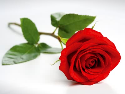
Red roses have green stems. Here is one with a white background. All three colors together.

ValentineRose.jpg
6-49-RJ9550D.jpg


Aren't we in the City of Roses? You see this color combination as "loud"?
 
Still not able to see the first image you're using in the last post.

As I try to look further without looking too close, if you use THAT shade of red from the previous post, it won't matter what the other colors are. There's a different between showing off the feathers the way Oregon does and committing outright assault on the eyes, never mind there have been a few schools that have worn something similar on the field. Nobody, to this point, makes a permanent color out of it.

It's probably less painful to use something a bit more maroon with the green. Will it stand out? Eh.
 
The Portland Rosebuds hockey team had this as their emblem in 1925:
200px-Rosebuds_Logo.gif

Maybe the Portland State Rosebuds?
 
Alan said:
The Portland Rosebuds hockey team had this as their emblem in 1925:
200px-Rosebuds_Logo.gif

Maybe the Portland State Rosebuds?

Not bad. However, half the problem is whether there's student ownership in this. So send it their way. That would be a start.

The "problem" (if you choose to see it that way): I think a change in mascot has a 50-50 chance of coming down to two choices, judging from the general national trend when brought to a "general population" of something like a student body.

Sporty McSport Face
Schooly McSchool Face

(If you don't get what's going on, google Boaty McBoat Face and you'll be on your way)
 
Pounder, well at least don't you think Broadway would be happy with that emblem on the side of the helmets?
 
In your opinion, which shades combination works best, are most appealing and easiest on the eyes? I tend toward a darker forest green than depicted and a lighter wine combination. I'm sure Nike could create some excellent combinations for us. Probably be fun challenge for them. Nix the 1920's design for now. A relic of the past and not our design to use.

color-thesaurus-correct-names-red-shades.jpg


main-qimg-98153a4eccef6a76fc91f36cd6202fdb
 
There’s been a timely (on more than one level) alteration at the 20th & Morrison entrance for tomorrow’s Thorns playoff game.

https://twitter.com/amandinehenry6/status/916197969862582273
 
Pounder said:
There’s been a timely (on more than one level) alteration at the 20th & Morrison entrance for tomorrow’s Thorns playoff game.

https://twitter.com/amandinehenry6/status/916197969862582273

Wow! it has Broadway's (and Portland Rosebud's) rose: plus the green jersey's "pity, 0." It just about says it all.

Tomorrow MSU, another bigskyconf 12 vs 5 match up.
 
As the University for the Rose City, what color of Rose serves best for Portland's Public University?

Right now, our color scheme erroneously includes black. This error is derived from the Tim Walsh era.

120px-Flag_of_Torhout.svg.png
Green & White are correct:

Green - For Portland, Oregon's forests of green, environmentalism and generation of innovative ideas
White - For Portland, Oregon's environmental purity, cleanliness and freshness

But Tim Walsh's choice of black was all wrong for Portland State:
skull-black-rose-6691300.jpg
Black stands for death and enmity.
Black roses are sent to anti-Valentines, ex-boyfriends, ex-girlfriends and enemies. They are also used for funerals and are a symbol of mourning. http://www.magforwomen.com/what-different-colors-of-roses-mean/2/

Funeral?! Mourning?! We should be celebrating this University for the Rose City. Sounds like a mongrel political influence from long past enemies of Portland having its own state university.

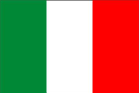
225px-Flag_of_Italy.svg.png
Celebrates Portland's fresh, green environment, the City of Roses

To be original and more unique, however, recommended to turn the color order around to red, white & green.

v650.jpeg
City of Roses till I die theme

Red - For Portland, Oregon's being the City of Roses, a symbol of love, the Rose Garden

love-couple-dogs-very-close-together-lying-grass-park-red-rose-each-mouth-42981266.jpg
s-l300.jpg


Portland State University should be all about Roses. Portlanders are all about and love their City of Roses. Why not, publically speaking, then, "University of the City of Roses" theme ... ?
 
On one hand, adding Ruby Red to a somewhat darker green at least looks- and sounds- like you're trying to romance Portland. I'd still call anything with green AND red as "experimental" at best.

OTOH... I think the whole "depression tack" is a joke. Look... people in this town associate "light airy" bars and restaurants with more dollar signs than they have, and associate "dark dingy" spaces with "I can negotiate my tab with the waitress."

(Personal experience; YMMV)

The rain brings the green, or else we'd have a lot more room at area weekend farmers markets... or there'd be less farmers markets. I'd never have thought I'd get overrun by hordes of people looking for veggies and jam in downtown Beaverton or just on the fringe of the Hollywood District like I have this year. If the rain depresses you, that's your problem. I keep finding Portlanders out in it.

(Again, personal experience, YMMV)

I'll put this another way. Maybe you're a baseball fan, and I get that. The Beavers could barely sell seats in April and May in this town. Thing is, Major League Soccer usually front-loads the Timbers schedule into those months because the Timbers sell out every freaking game. This tells me that it is possible that content matters.

(No, this is more than personal experience, this is documented fact.)

Content matters.
 

Latest posts

Back
Top