FasterThanYou
Active member
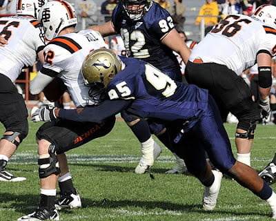
Before we all go into hibernation or withdrawal from football, I found a review of UNC uniforms from this summer. (SIAP - but I didn't see it anywhere.) We would have been rated okay, except this Brett guy hates everything. Hey, what you going to do? Can't please everyone, apparently.
http://www.theupsetblog.com/2011/07/rate-that-uni-northern-colorado.html
Have to agree with the critic who said "why does the helmet say NC, nobody calls it NC."
.............................................discuss.
Rate That Uni: Northern Colorado

HELMET

UNIFORMS


NORTHERN COLORADO
------------John --Zach --Brett --AVG
Helmet ---B --------C+ ----F -------C-
Home uni C+ -------B- ----C- ------C+
Road uni- A- --------B -----C- ------B-
OVERALL -B ---------B- ----D+ -----C+
http://www.theupsetblog.com/2011/07/rate-that-uni-northern-colorado.html
Have to agree with the critic who said "why does the helmet say NC, nobody calls it NC."
.............................................discuss.
Rate That Uni: Northern Colorado

Rate That Uni also makes a stop in Greeley, Colorado today for the Northern Colorado Bears. As usual, our panelists give their thoughts, and you can cast your vote.
HELMET

UNIFORMS


NORTHERN COLORADO
------------John --Zach --Brett --AVG
Helmet ---B --------C+ ----F -------C-
Home uni C+ -------B- ----C- ------C+
Road uni- A- --------B -----C- ------B-
OVERALL -B ---------B- ----D+ -----C+
John: If not for the monochrome home uniforms, this would be a pretty nice set. Unlike some other Big Sky uniforms, they could have a VERY nice set of uniforms with one or two minor tweeks. First, and this is consistent with almost every team that has gold or silver as a secondary color, the pants - for both home and away - should be that color. Gold in UNC's case. The only other change that needs to be made is the helmet logo. I'm from Colorado. Nobody calls Northern Colorado "NC". It's "UNC" or "Northern Colorado" or "Northern". So here's what to do. Ditch the "NC". It's hokie. It looks like it should be for some school called "Newhart College" or something. If you're married to the letters, go with "UNC". But, why not use a Bears logo? You can't do anything with this? Really, UNC, you're THIS close to an "A" set of uniforms.
Zach: New Balance has seemingly taken the anti-Nike approach to the uniform contracts they receive. I don't mind the NoCo looks, even if a bit mundane. I like the shoulder stripes and number font. The helmet doesn't really do much for in terms of branding. The NC is boring. I have always been a fan of the plain pant. All around, not a bad effort for the Bears.
Brett: Normally a fan of simplicity, but this looks like Northern Colorado didn’t even try. New Mexico State has a rival in the “worst helmet” category. This whole ensemble looks like the Bears forgot about football uniforms, called New Balance in a panic, and ordered the most basic set in their school colors. There are zero stripes, the plainest block numbers available, and the plainest serif lettering available on the helmet. They even removed a white outline from the helmet letters recently. None of these things individually are catastrophic, but together, this looks as cheap as you can get.


